
How to view regional reports
for the 2025 nationwide assessment of the National Procurement Strategy
Regional leads (or their nominated representatives) may view reports showing all organisations in their region.
Follow the instructions below.
Note:
- reports will be automatically updated as each response is submitted
- there is specific guidance on how to monitor ongoing participation at https://lga-lms.demo.nipltd.com/how-to-view-ongoing-participation/)
Steps to access, and view reports
The process is outlined below:
Follow the link in the email
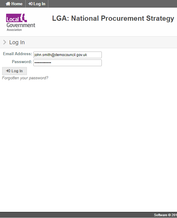
Click on the link sent to you by email or go directly to https://lganps.saas.nipltd.com
Login
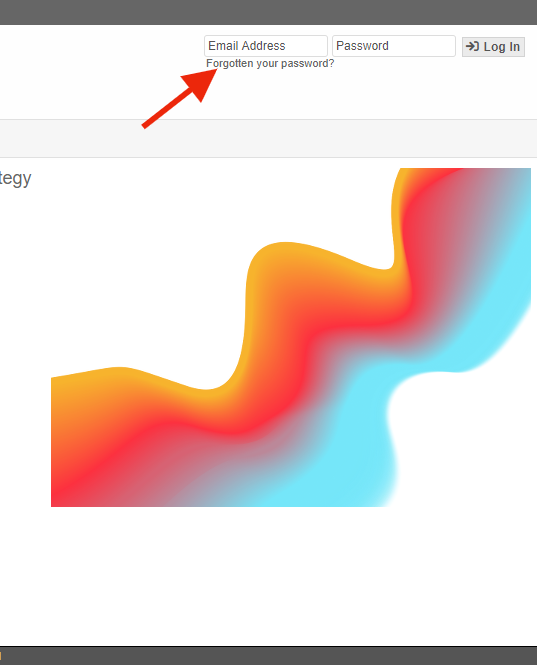
Enter email address and password (click ‘Forgotten Password’ if you can’t remember your password).
If this is the first time you’ve been given access, use the ‘Forgotten your password?’ link to set a new password.
Existing users
New users
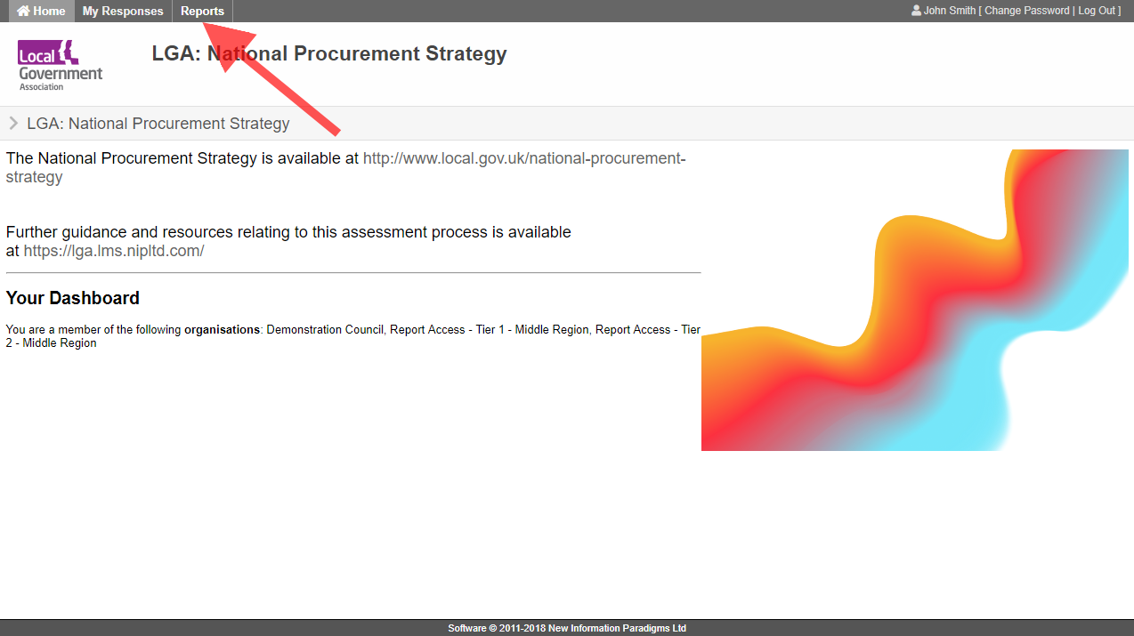
Go to 'Reports'
Click on ‘Reports’ in the top menu
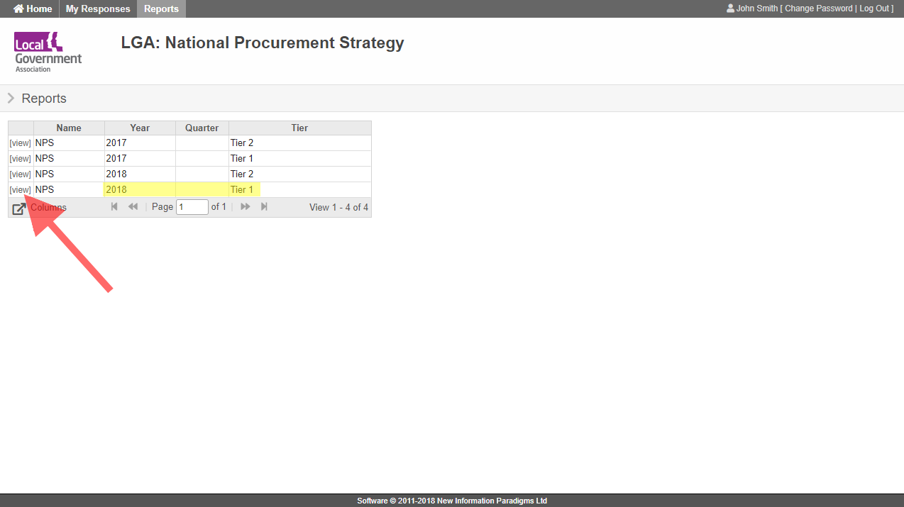
Click 'view'
Find your report in the table.
If you have multiple reports, the ‘Year’ and ‘Tier’ columns will indicate which one you want.
Click the ‘view’ link next to the report you want to open.
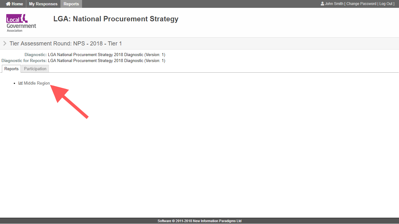
Click on the report link
Click the report you wish to access.
(Note, if you only want to see participation stats, you can alternatively click on the ‘Participation’ tab).
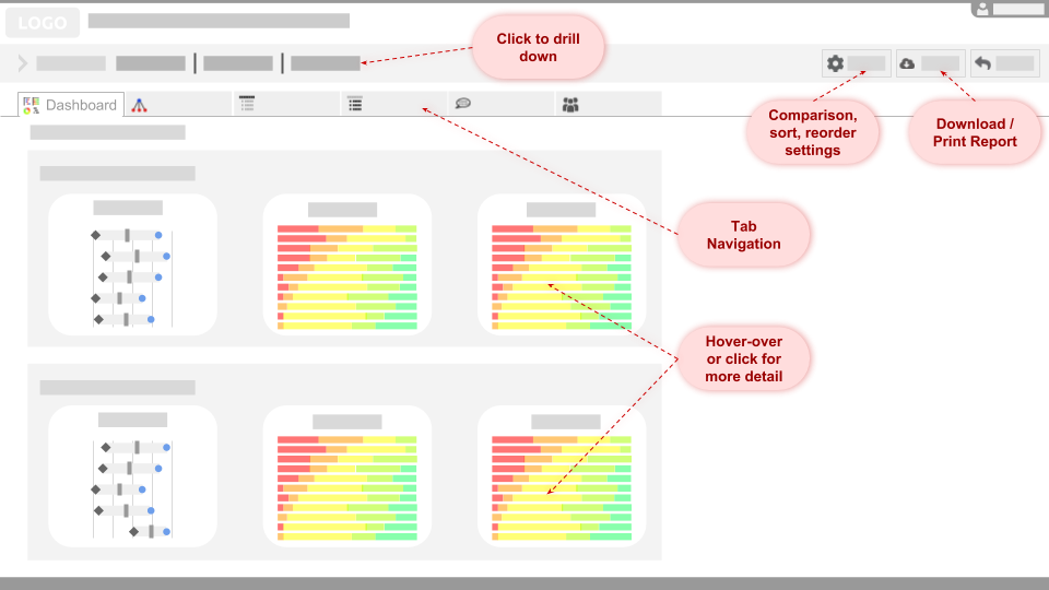
Report Dashboard & Navigation
The first tab you will see is a dashboard showing previews of the key charts (each can be clicked on to open the full chart in the corresponding tab).
Filters (top left) can be used to drill down into specific report elements (organisations, sections, questions).
Use the tabs to navigate to different data sets.
Optionally use ‘settings’ to change comparison scores, sort orders or comment groupings.
Most charts will show more information when the mouse is hovered over an element. They can also be clicked on to drill down into more detail.
The reports are primarily designed to be viewed online. However, the entire report (or any subsets) may be downloaded as a pdf.
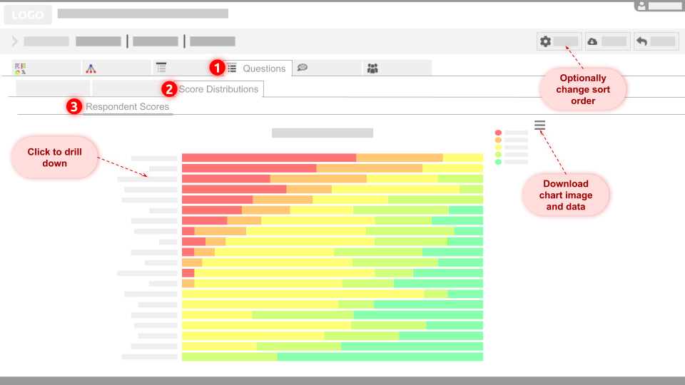
Suggested starting point
We suggest you start at ‘Questions’: ‘Score Distributions’ for all respondents in the region. To do this, ensure the filters (top left) remain in their default position (‘All Organisations’, ‘All Sections’, ‘All Questions’) and then select the tabs shown numbered in the image here.
Score Distribution chart colours (red, amber, yellow, light green, green) correspond to the 1-5 score statements presented to respondents.
The default sort order shows the highest total number of ‘low scores’ (red and amber combined) at the top.
Sort order can be changed in the settings menu.
Each chart image (and data) can be downloaded – e.g. to add to your own presentations.
(Note: Hover over the chart for more detail, click to drill down further)
8.
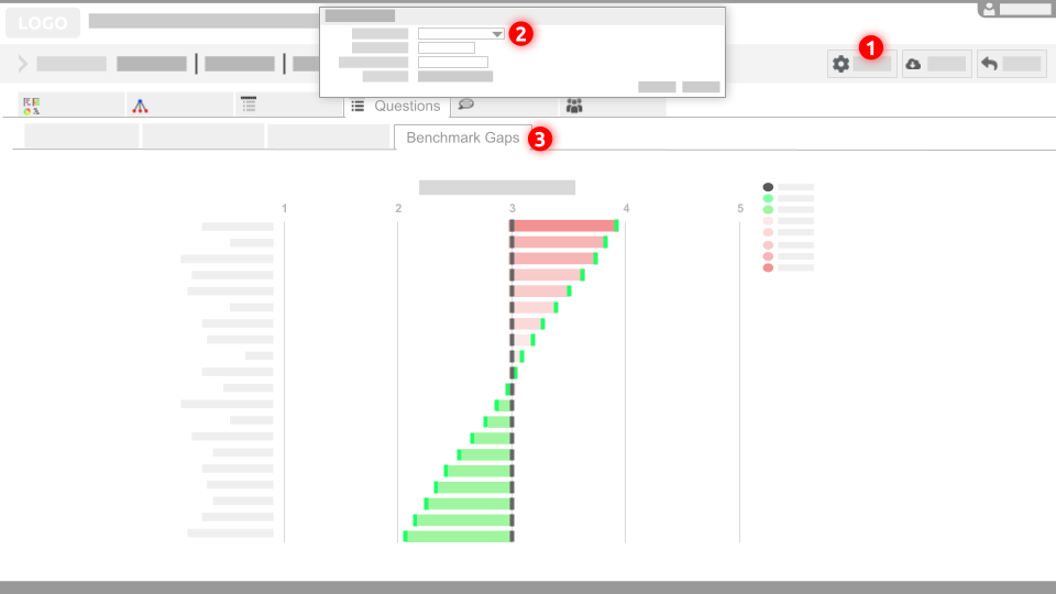
Comparison reporting
It is now possible for those people with regional report access to compare regional averages to the national average, or to compare specific organisation scores to the regional or national averages.
- Click on the “Settings” button
- Select which data set you would like to “Compare with” and click “Apply”
- Navigate to the newly visible “[Comparison] Benchmark Gaps” tab
The Value Codes are ordered with the largest gap below the average score at the top and the largest gap above the average score at the bottom.
Respondents can compare their own council to regional and national averages using their own response report (see ‘How to access and download your response report‘ for instructions).
If you have any questions about reporting that aren’t covered in the FAQs, please contact Rowena Ward: rowena.ward@sps-consultancy.co.uk
Software 2018 © New Information Paradigms - Privacy Policy